Charts
Create a Chart page
The Create a chart page is divided into three parts:
- On the left, you can select your chart's perimeter, type, axes, and filters;
- In the center, you can see your chart's name as well as its preview;
- On the right, you can select your chart's attributes using the list. (This Select the attributes part on the right can be hidden depending on your screen size).
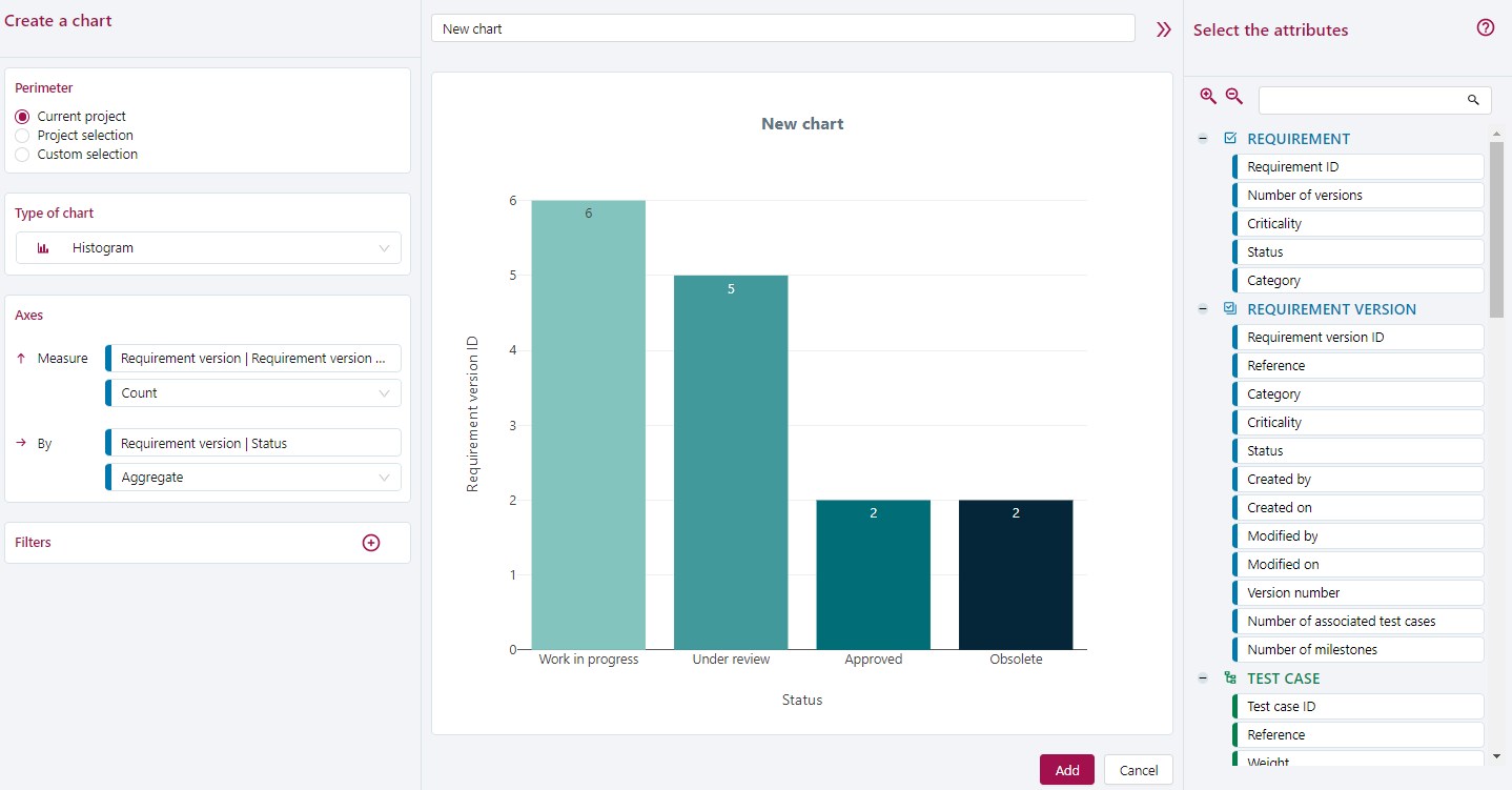
Before you can generate and add a chart, you must:
- give a name to the chart;
- select its perimeter;
- select its type;
- enter its axes in the Axes block.
Once you have created your chart, you can edit it by going on its consultation page and clicking on the button  . You can also download your chart by clicking on the button
  .
.
Select Chart perimeter
To select your chart's perimeter, you have three options:
Current project: For this option, the perimeter taken into account is the entirety of the project in which the chart is created. The default perimeter is fluctuating, which means that it varies according to the project where the chart is located (if the chart is copied or moved to another project);
Select project(s): This option enables you to select one or multiple projects. By clicking on it, the list of projects for which you have rights appears. With this option, the perimeter is fixed and does not adapt itself to the project in which the chart is located;
Custom select: With this option, you can select objects (requirements, test cases, campaigns, folders) by workspace (Requirement, Test Case, and Execution). For this option, the perimeter is fixed as well.
Chart type
You can create five different types of charts:
Pie: (diagram) with axis choice
This chart only accepts aggregations. Each part represents the number of recordings corresponding to the indicated value;Histogram: with choice of the x-axis and y-axis.
This chart requires an aggregation or a grouping by date on the horizontal axis (By), and a numerical value (Count, Min, Max, Average, or Sum) on the vertical axis (Measure);Evolution: with choice of the x-axis and y-axis.
This chart requires an aggregation or grouping by date on the horizontal axis (By), and a numerical value (Count, Min, Max, Average, or Sum) on the vertical axis (Measure). The values on the vertical axis are added together as you move along the horizontal axis, to obtain an aggregate;Trend: with choice of the x-axis, y-axis, and data series.
This chart requires an aggregation or grouping by date on the horizontal axis (By) and for Series, and a numerical value (Count, Min, Max, Average, or Sum) on the vertical axis (Measure);Comparative: with choice of the x-axis, y-axis, and data series.
This chart requires an aggregation or grouping by date on the vertical axis (By) and for Series, and a numerical value (Count, Min, Max, Average, or Sum) on the horizontal axis (Measure). The Comparison chart is horizontal in contrast to the Trend or Histogram chart.
| Axis \ Type | Pie | Histogram | Evolution | Trend | Comparative |
|---|---|---|---|---|---|
| By | Aggregation | Aggregation or Grouping by date | Aggregation or Grouping by date | Aggregation or Grouping by date | Aggregation or Grouping by date |
| Measure | Numerical | Numerical | Numerical | Numerical | |
| Series | Aggregation or Grouping by date | Aggregation or Grouping by date |
Select attributes for Chart axes
You can select these entities as attributes:
- Requirements;
- Requirement versions;
- Test cases;
- Campaigns;
- Iterations;
- Execution plan items;
- Executions.
You can select each attribute independently of the others.
Select attributes
To select an attribute, you can:
- on the right, from the part where you can select attributes: drag and drop the attribute to the chart's preview zone. The attribute will automatically be added to the first axis in the Axes block;
- on the right, from the part where you can select attributes: drag and drop the attribute directly on the axis you want (only works if the axis is not yet selected);
- on the left, from the Axes block, click on the desired axis. A sidebar appears with all the attributes sorted by entity. Click on the attribute to select it.
Once you have selected all your axes, the chart preview is automatically updated.
The operations you can do depend on the type of attribute you have chosen:
- Aggregation: indicates that there will be a chart element for each encountered value of this attribute;
- Count: counts the number of distinct values obtained;
- Maximum, Minimum, Average, and Sum: apply to the numerical-type attributes;
- By day, by week, by month, by year (Grouping by date): apply to date-type attributes.
When selecting an attribute for an axis, a default operator appears according to the type of attribute chosen to facilitate the chart's creation. You can change this operator to better fit your expected results.
Custom fields and lists
For the entities Requirements versions, Test cases, Campaigns, Iterations, and Executions, you can have the custom lists they are linked to as attributes.
The color of the curve will then be slightly lighter than for SquashTM's native attributes.
The custom fields must be of the types "simple text", "drop-down menu", "date", "checkbox", "tag", and "numerical value". You cannot create charts with "rich text" custom fields.
Info
All default list attributes have predefined colors in custom charts.
The charts created from list-type custom fields as well as custom lists will be in the colors defined in the Administration workspace.
Set Up filters
Filters enable you to refine your data by only selecting what you want to see on the chart.
The list of filters you can choose changes according to the type of attribute you have chosen:
- Is greater, Is greater or equals, Lower, Is lower or equals, Between, Equals, and Not equals: can apply to numerical or date attributes;
- Equals and Like: can apply to free text attributes (e.g. Reference);
- In: can apply to list attributes (e.g. Importance, Status). The 'In' filter enables you to select multiple values from a list.
You can apply filters on all the selected attributes or just some of them.
Info
You can add custom charts to a custom dashboard. To learn more about custom dashboards, please visit "Custom dashboards"
Examples of Charts
Pie Chart
On this example, requirements are distributed according to their criticality.
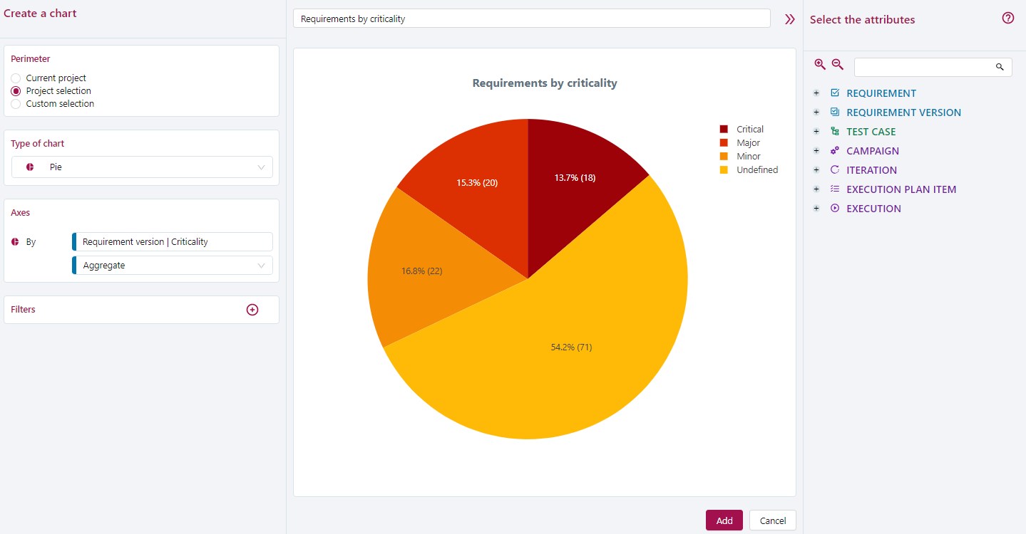
A Criticality is a list of values that is interpreted as an aggregation.
To organize requirements with only one aggregation, use the Pie chart.
Histogram Chart
This example represents the number of functional, business, and user stories requirements (values of the Requirement Category list) for a given functional perimeter (a folder).
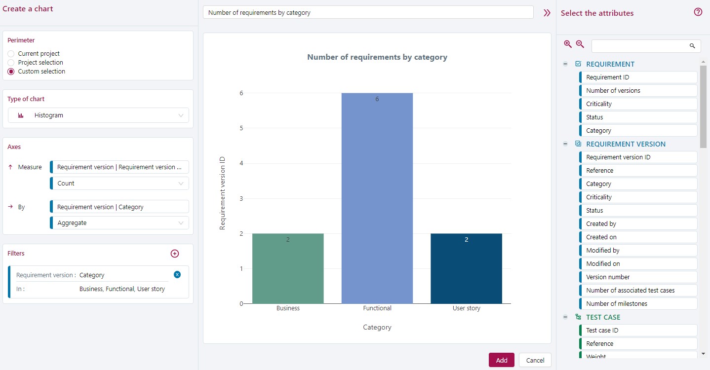
A Category is a list of values that is interpreted as an aggregation. It can be cross-referenced with the requirement IDs that will be counted for each value in the list. The perimeter will first be filtered to obtain only the requirements of the folder. Then, it will be filtered a second time on the three selected categories.
A Histogram is the most suitable chart to cross-reference an aggregation and a count.
Evolution Chart
This example tracks the creation of requirements over time for a project.
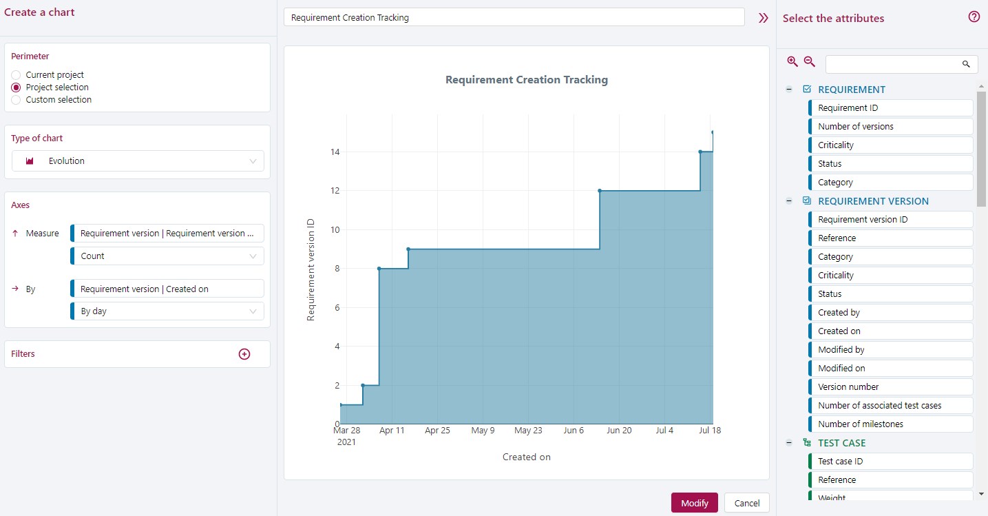
To see the design evolution, select the requirements Creation date attribute to group them by date
To count the number of requirements created each day, count the number of Requirement version IDs.
To restrict data to those of the project, filter the perimeter.
In this case, the Evolution chart is the most suitable chart.
Trends Chart
This example tracks the creation of tests for five testers over a 30-day period. Only the tests containing test steps are included.
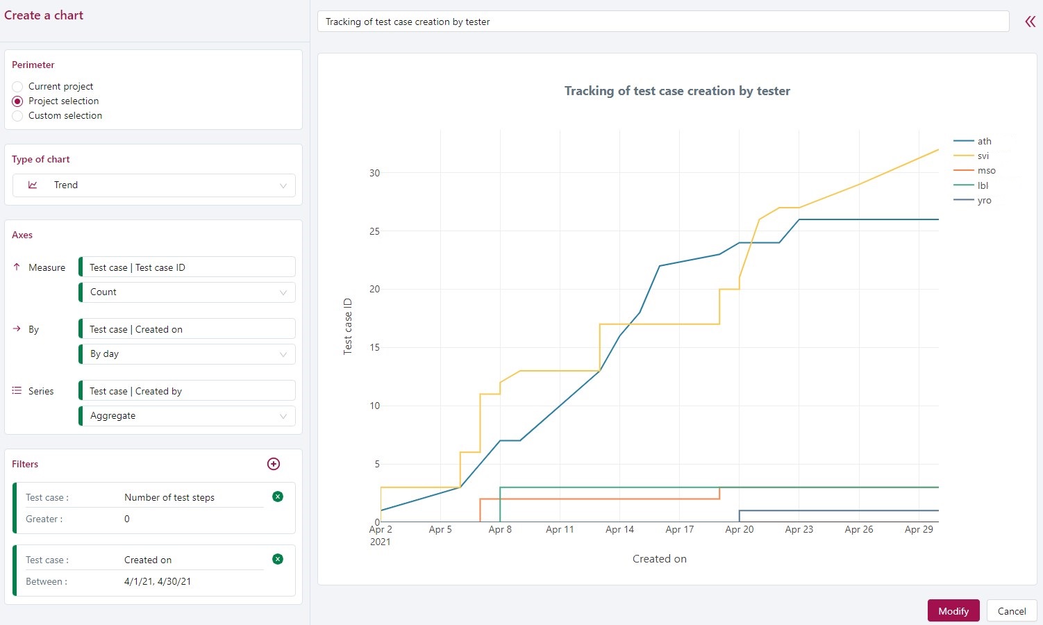
To see the design evolution, select the test cases Created on attribute to group them by date.
To aggregate your test cases, select the Created by attribute to group by the login of the testers who created them.
To count the number of test cases created each day, count the number of Test case IDs.
To restrict the data to a certain period of time, filter the creation date.
And to make sure you only get test cases that have test steps, you must add the attribute Number of test steps and filter them.
In this case, the most suitable chart is the Trend chart.
Comparative Chart
This example represents the execution status of a campaign's tests according to each of the testers.
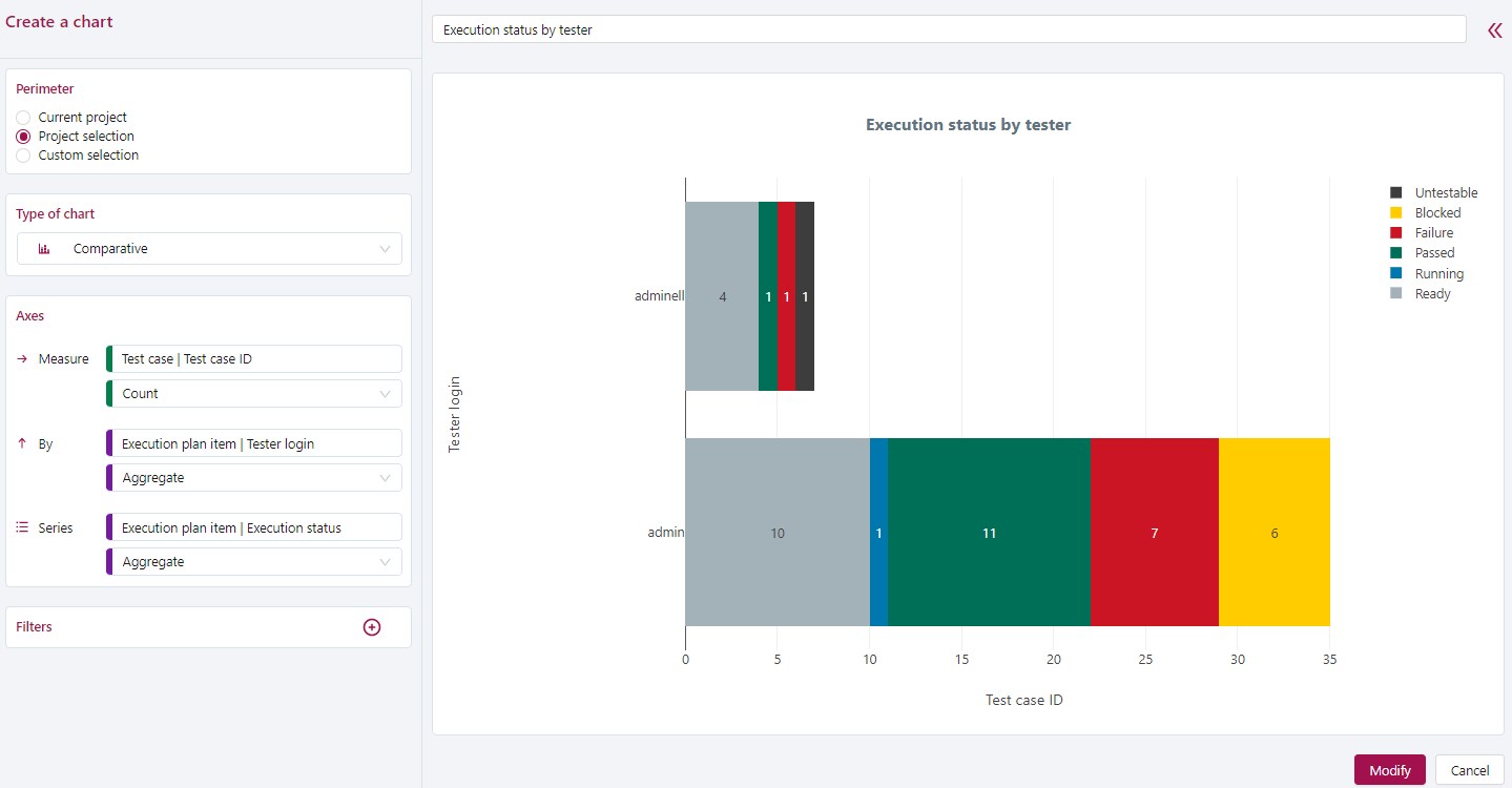
This chart's two aggregations will be the tests' Execution status and the Tester login. To count the number of test cases by tester, count the number of Test case IDs. To restrict the data to one campaign, filter the perimeter.
In this case, the most suitable chart is the Comparative chart.